As soon as you log on, you can access your Dashboard, which contains all the information you need to manage your fleet, as well as access to your account settings.
The top part of the dashboard shows you figures for your reimbursements, your expenses to be processed, your bank account, etc.
The green widgets can be clicked on to display full details of your information.
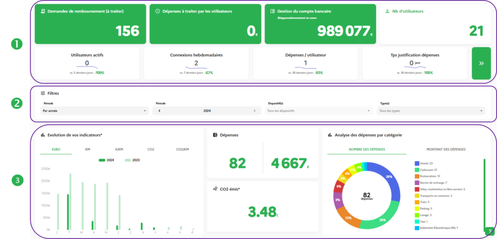
At the top right of your screen, click on your name to access your information, account configuration and training.
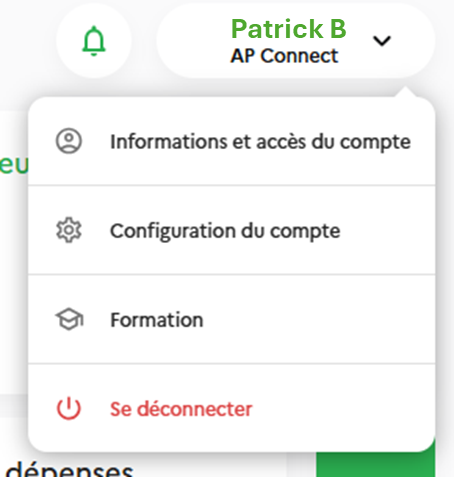
1) The main widgets
Refund claims (to be processed)
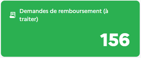
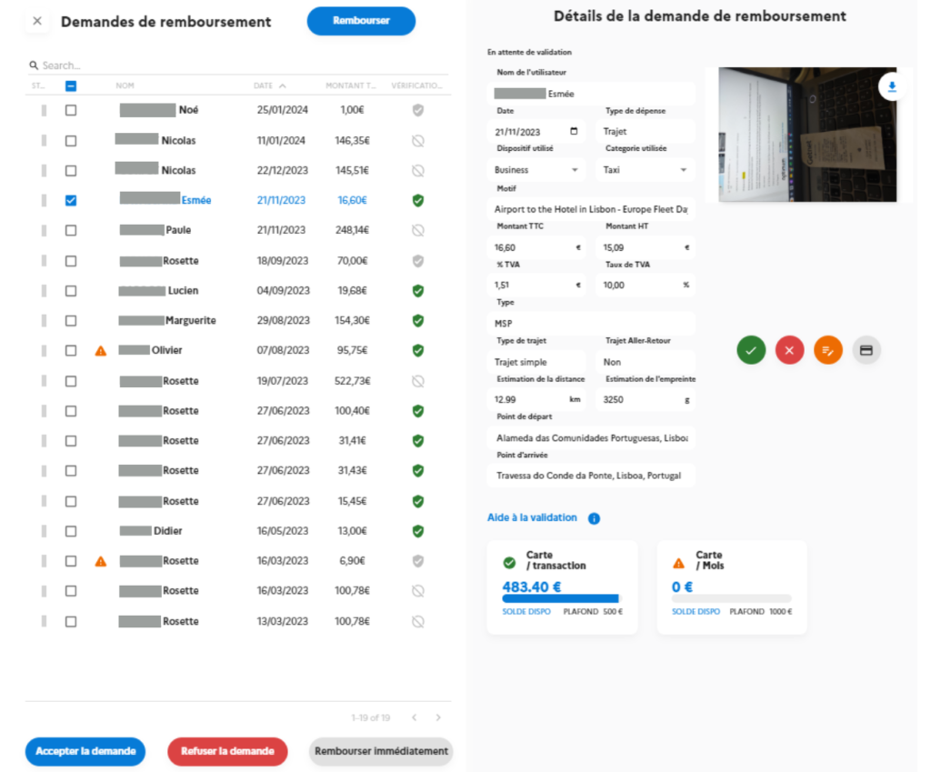
This indicator lists employees’ expense claims paid using theirpersonal payment method, together with their supporting documents. You can view these receipts and, either individually or en masse, accept or reject reimbursement requests.
For a more detailed article, click here.
Expenses to be processed by users
This indicator lists employees’ expense claims paid using theirpersonal payment method, together with their supporting documents. You can view these receipts and, either individually or en masse, accept or reject reimbursement requests.
For a more detailed article, click here.
Expenses to be processed by users
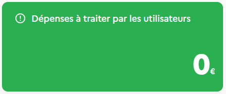
This indicator shows the total amount of expenditure that has not been justified by users. Users have not photographed the receipt or qualified the expense. Clicking on this indicator will display the details of these expenses and you can export this list in .csv format.
However, these are expenses that have been incurred and debited to the company’s account.
The total amount shown on the tile is already included in the ‘Expenses’ tab in point 7.
Bank account management
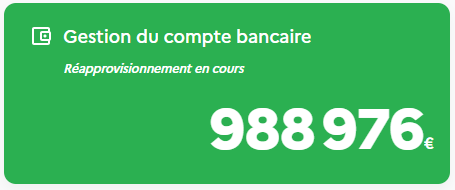
This widget shows the amount currently available in the company’s Mobility Pack account. Clicking on it takes you to a new tab in the banking application, where you can view your account and transaction details.
Number of users
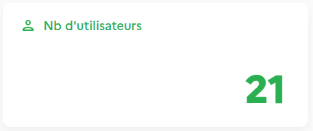
This indicator shows you the number of users of the solution, whether or not they have a payment card.
By clicking on the indicator, you can access the list of employees with their contact details, their profile and the number and amount of their expenses associated with the corresponding CO² emissions.
You can also add new users from this page, and manage their access (more details here). For more details on onboarding, click here.
Cartes
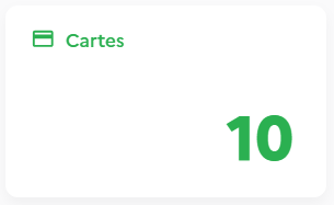
This block shows the total number of active cards in your account.
Number of active users
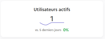
This indicator shows the total number of users who have opened the application at least once in the last 5 days.
Weekly connections
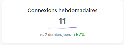
Administrators can see when each user last logged on to the mobile application. This makes it possible to identify inactive users and take steps to re-engage them.
Expenditure per user

The ‘Spend per user’ widget shows the average number of CB transactions made per user over the last 30 days.
Average time taken to justify expenditure
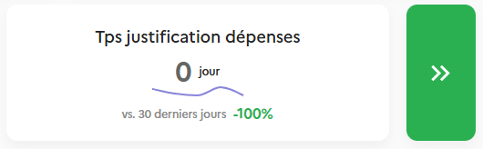
This widget shows the average time taken to justify expenses over the last 30 days.
2) Filters

You can apply different filters to display your expenses according to different criteria. By period: year, month, week, or between two specific dates. By calendar year. Or by Scheme (business expenses, Sustainable Mobility Package, Mobility Credit, for example). These filters can be combined.
3) Changes in your indicators
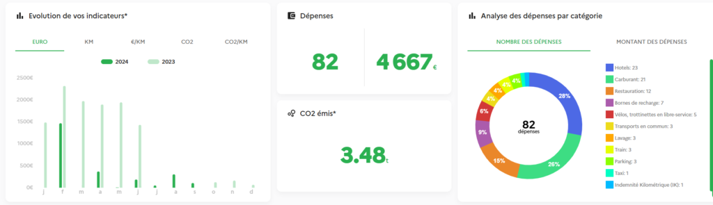
From one year to the next, you can view the evolution of your expenses, the number of kilometres driven, and the quantity of CO2 emitted according to 5 axes: euros, km, €/km, CO2, CO2/km.
Expenses
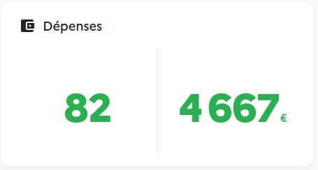
You can see the number and amount of expenses incurred, including expenses that have not yet been justified but have already been debited. For more details, consult the dedicated page here.
Finally, at the bottom right of your screen you’ll find a graph summarising your expenditure in terms of quantity or value, as well as an analytical breakdown by category (fuel, parking, hotels, etc.).
CO2 emitted
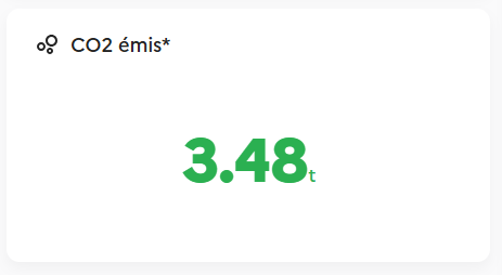
This indicator shows the quantity of CO2 emitted by your mobility expenditure over the chosen period. It is expressed in tonnes.
It enables you to measure your carbon impact effectively.
Analysis of expenditure by category
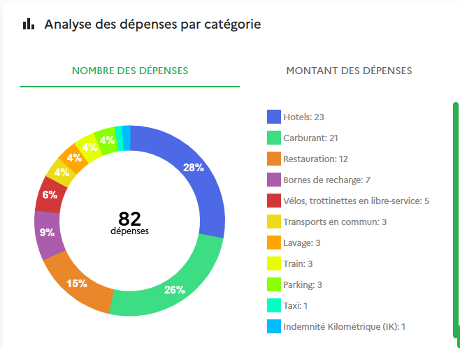
This function provides a detailed graph of the expenses incurred by your employees, expressed as a percentage according to the number of expenses and the amount spent.
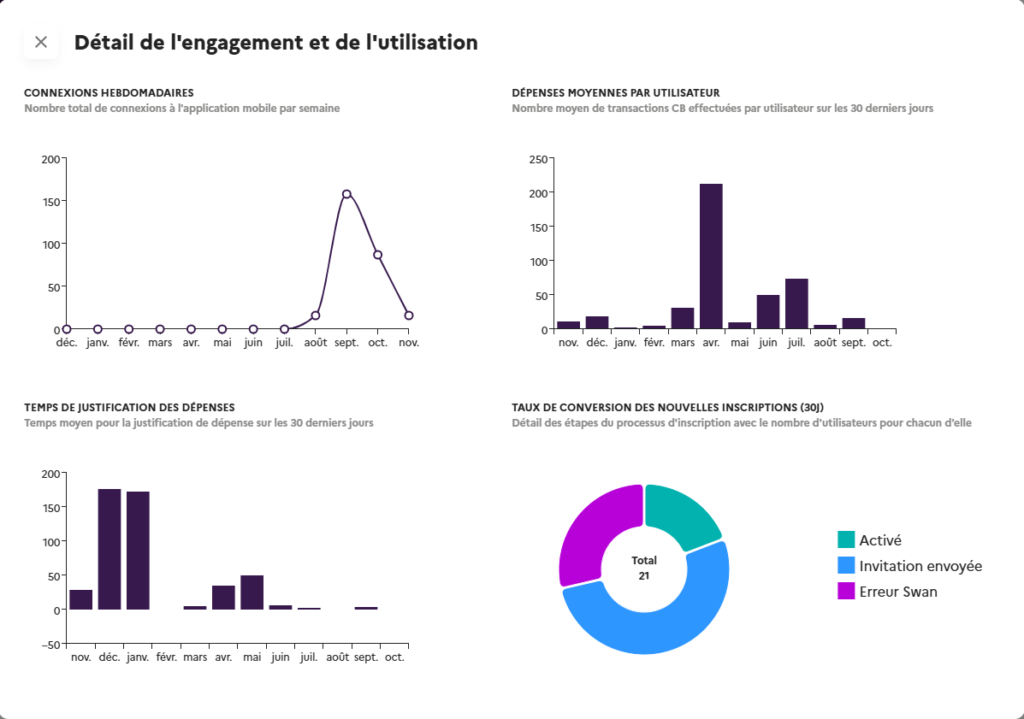
Details of commitment and use
You can access the details of the indicators by clicking on this button.
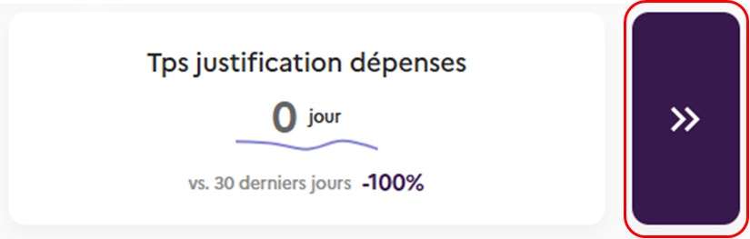
This page details the performance indicators represented by graphs. You’ll find trends in weekly connections, average expenditure per user, time taken to justify expenditure and the rate of integration of new employees.